
According to World Health Organisation (WHO) estimates, South Africa continues to have one of the highest burdens of tuberculosis (TB) in the world. The burden of a disease refers to the number of infections and deaths within a population and the associated costs of treatment of a specific disease.
A Spotlight report says: “Here we attempt to tell the story of the burden of TB on human life using several graphs. As the story of TB cannot be separated from that of HIV, we use estimates from both the WHO TB data portal and the Thembisa mathematical model of HIV in South Africa to examine trends in the data from 2000 to 2017.
1. How many people in SA get TB?
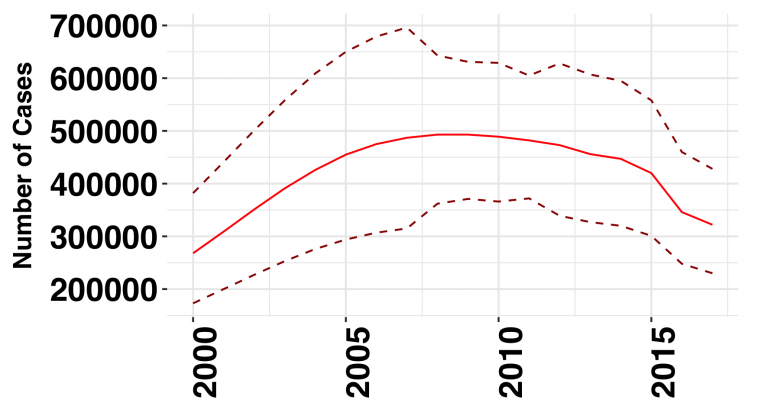 “The graph above shows the estimated number of TB cases per year in South Africa from 2000 to 2017. The solid red line indicates the median WHO estimate of the number of TB cases – these are the figures that are most commonly quoted. As you can see, the number of TB cases in South Africa is estimated to have been relatively stable from 2006 to 2014, peaking at approximately 500 000 cases in 2008, yet has decreased substantially since 2015.
“The dashed lines on the graph represent the high and low bounds of the estimates (in technical terms the 95% confidence interval). The fact that these lines are as far apart as they are tells us that there is very significant uncertainty about these figures and that we should take the estimates reflected by the red line with a grain of salt. As you can see from the dashed lines, the number of TB cases per year may well have peaked in 2007 at nearly 700 000 or in 2011 at only 370 000 – with the limited information at our disposal we can’t be sure.
“All of the graphs below use the relatively uncertain WHO TB estimates and should likewise be taken with a grain of salt.
2. TB cases and HIV status
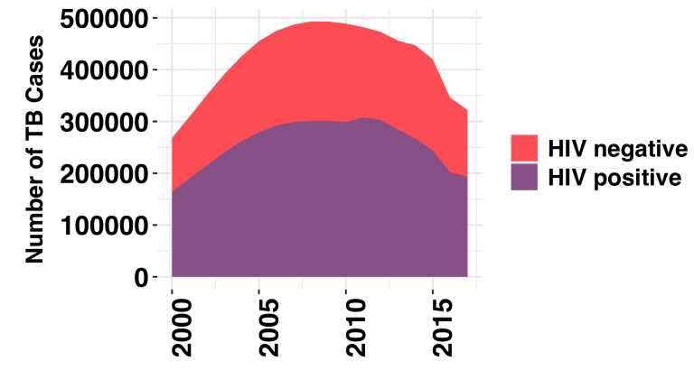 “The graph above shows the number of new cases of TB per year in South Africa. The coloured regions divide the number of new TB cases by HIV status. Well over half of all people who develop TB are living with HIV, as you’d expect in a country where the TB burden is fuelled largely by the HIV epidemic. The total number of new TB cases peaked in 2008 and has since been declining – a decline that is linked to the increase provision of antiretroviral therapy. Providing people living with HIV with antiretroviral therapy makes it much less likely that they will develop TB.
3. How many people die of TB in SA?
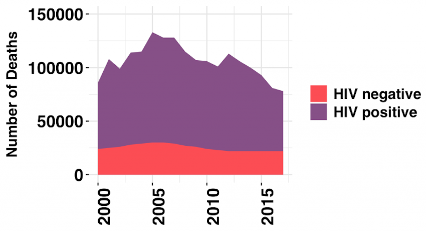 “The graph above displays the number of deaths from TB, with the different colours once again representing the breakdown by HIV status. The large swath of purple clearly indicates the majority of deaths from TB have been in people who were living with HIV. Deaths from TB among HIV positive individuals peaked in 2005 at approximately 130 000. It has decreased dramatically since then primarily due to increased access to antiretroviral therapy.
“The downward trend in TB mortality among HIV negative individuals, however, has not been as dramatic and has stagnated in recent years. Mortality peaked in 2005 at 30 000 deaths and was estimated at 22 000 in 2017. The plateau in TB mortality for HIV negative patients suggests that we are not doing a particularly good job at treating and preventing TB specifically – and supports the suggestion that most of the progress we have seen against TB in South Africa is fuelled by the country’s impressive HIV treatment programme.”
[link url="https://www.spotlightnsp.co.za/2019/07/02/tuberculosis-in-sa-three-graphs-that-tell-the-story/"]Spotlight report[/link]